Color Is the Flex: Color-Driven Prom & Gala Suits for a New Generation
After more than twenty years of designing, I can say this without hesitation. Color is not decoration. Color is strategy. And in today’s prom and gala suit landscape, color is doing more of the heavy lifting than cut, lapel style, or button placement ever could.
Traditional menswear previously leaned heavily on restraint.
Black, charcoal, and navy ruled for decades because they were practical, authoritative, conforming, and safe. These colors masked wear and projected seriousness, which made sense when suits were uniforms rather than personal statements. Color existed, but it was controlled and rarely encouraged.
That mindset has completely shifted.
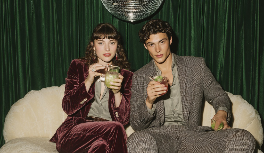
Modern prom suits and gala suits are no longer about blending in or signaling status. They are about identity. Clients want their suit to say something immediately, and color is the fastest and most powerful way to do that. A well-chosen color communicates confidence, creativity, and intention before a word is spoken.
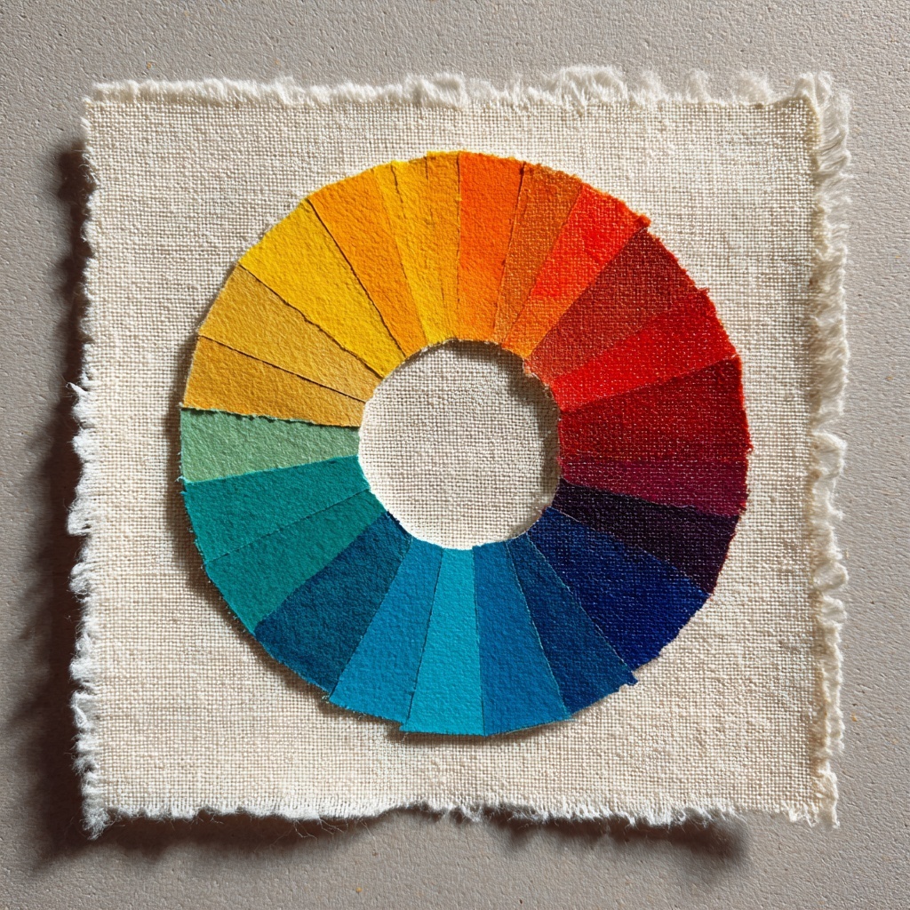
Understanding the color wheel is essential to making this work. Complementary colors create contrast and energy. Analogous colors create harmony and flow. When someone asks why a deep green suit flatters so many skin tones or why burgundy photographs better than a bright red, the answer always comes back to color theory. Green balances warm and cool undertones. Burgundy delivers depth without overpowering the wearer. These are not by accident. They are deliberate design choices.
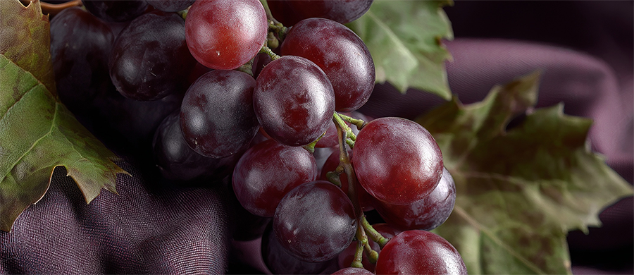
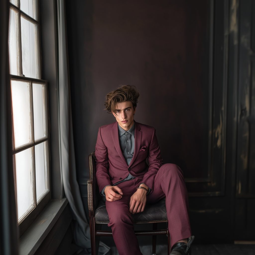
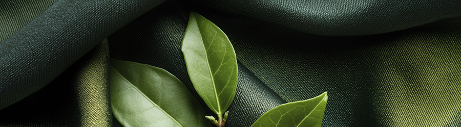
What we are seeing now is a move away from flat, predictable suit colors and toward layered, intentional tones. Jewel colors like emerald, sapphire, and aubergine dominate prom floors because they feel rich, modern, and elevated. Earth tones such as clay, sand, olive, and tobacco are increasingly popular for gala events because they feel grounded and refined. Even lighter colors like stone, dove gray, and soft blue are making their way into formal wear when tailored properly.
This evolution has also brought color blocking into the conversation. In modern suiting, color blocking might mean pairing black trousers with a bold dinner jacket. It might mean tonal layering, like a navy suit with a slightly lighter shirt and deeper accessories. It might also mean anchoring a statement jacket with neutral pants to keep the look wearable. When done correctly, color blocking adds dimension without overwhelming the silhouette.
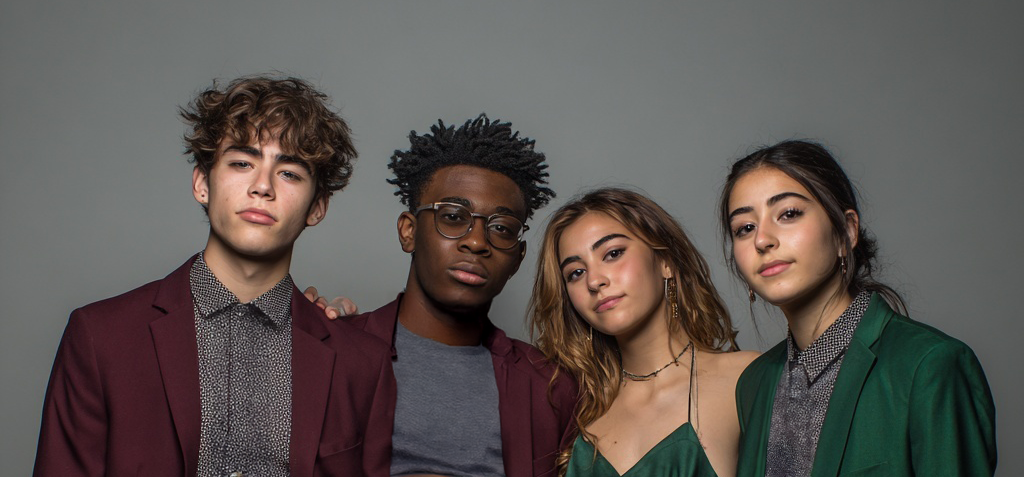
Younger wearers gravitate toward this approach because it allows individuality without turning the suit into a costume. A forest green jacket with black trousers still reads formal. A plum suit paired with charcoal feels elevated and intentional. Color blocking gives permission to experiment while staying sharp.
The biggest shift I have seen is confidence. Today’s clients understand that color is no longer about rules. It is about purpose. If the suit fits properly, the color works with the wearer, and the look is owned with confidence, the result is undeniable.
The future of prom and gala suiting is not louder. It is smarter. Color is doing the storytelling now. When used correctly, a well-designed suit says everything about who you are and where you are headed, without saying a word.
by: VESEY
Look and feel your best on your special day!! – Learn about our Vesey events & weddings style services and our virtual tailoring options – https://veseyexclusive.com/weddings
Not sure where to start to decide your wedding look? – Schedule your complimentary virtual design session!